How to Create Automated Sales Reports for Your E-commerce Business
Tracking sales data manually is a full-time job.
E-commerce managers often find themselves buried in Excel sheets — filtering rows, building pivot tables, and updating charts just to understand what’s happening in their business. And when sales peak, reporting becomes even more chaotic.
This guide walks you through a better way: automated reporting tailored for e-commerce, using real business metrics and AI-powered dashboards.

Common Reporting Challenges in E-commerce
E-commerce teams face unique reporting problems that grow with scale:
- Shopping cart abandonment is hard to diagnose without trend analysis.
- Marketing budgets are allocated based on guesswork, not performance insights.
- Customer satisfaction metrics are scattered across feedback forms, chat logs, and reviews.
- Identifying the right audience requires segmentation — often lacking in standard reports.
- Campaign targeting feels like a shot in the dark without behavioral breakdowns.
Sound familiar? You're not alone.
What Automated Sales Reports Can Do
Automated reporting tools can turn raw Excel exports and order data into dynamic dashboards. Here's how:
1 How to identify top-selling products automatically from Excel
Knowing which products actually drive your revenue isn't always obvious — especially when you're dealing with seasonal spikes, bundles, or overlapping discounts.
This bar chart surfaces the highest revenue-generating SKUs over the past 30 days, giving you clarity on what’s working right now — not just what’s popular.
It lets you focus your restocking and promotions around proven performers, without digging through pivot tables or grouped exports.
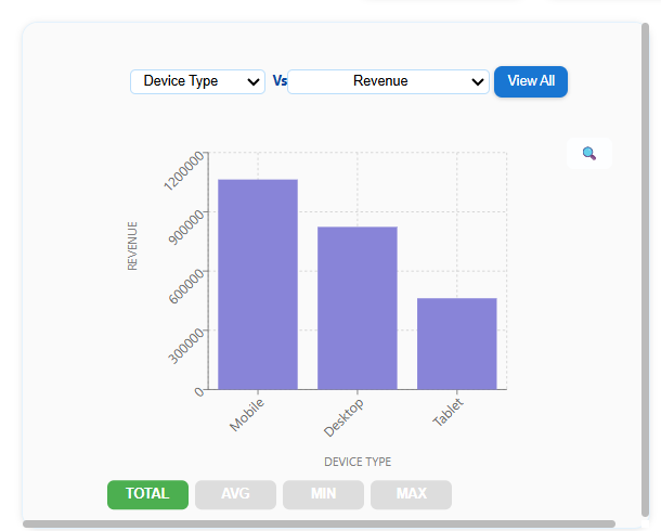
This view was generated automatically in AutoGen Reports after uploading a simple sales export from the store’s backend.
Tips from Analysts
-
Compare top-selling SKUs across time periods to spot seasonality.
-
Track both units sold and revenue — some low-volume items drive high margin.
-
Filter out returns or bundled items to get true performance.
Common Mistake Assuming high order count = high revenue without checking average order value (AOV).
2 How to detect cart abandonment trends using Excel reports
Cart abandonment is a tricky issue — the cause isn’t always price. Sometimes it’s a slow page, a traffic spike, or even a misplaced coupon code.
This trend line overlays abandonment rate vs traffic and page load time, making patterns more visible over time. You’ll quickly see if a campaign drove unqualified traffic, or if your site underperformed during peak hours.
Spotting these relationships helps you respond early, instead of waiting for conversion rates to drop.
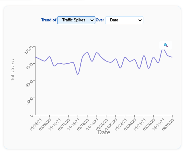
This chart was built instantly in AutoGen Reports after uploading session logs and cart metrics from the last 4 weeks.
Tips from Analysts
-
Overlay abandonment rate with load time spikes and mobile vs desktop performance.
-
Look for time-of-day patterns — slow checkout flows during peak hours often correlate with drop-offs.
Common Mistake Blaming pricing first — when the real issue is often friction in the final step (like coupon fields or payment failures).
3 How to segment customer behavior by region, device, and traffic source
Customers don’t behave the same way across regions, devices, or sources — and flat reports often hide those patterns.
This pie chart shows revenue contribution by device type and region, helping you understand which audience segments are actually converting and driving revenue.
With a clear breakdown, you can tailor offers more precisely — instead of running generic campaigns across the board.
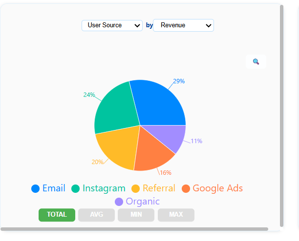
This segmentation view was generated in AutoGen Reports using basic source and revenue columns from a Shopify export.
Tips from Analysts
-
Start with geography + device as your base segmentation pair — it reveals more than either alone.
-
Watch for low-converting segments with high traffic — they signal poor targeting.
Common Mistake Optimizing for average behavior instead of segment behavior — one-size-fits-all rarely works in campaigns.
4 How to compare ad channel ROI without using formulas
E-commerce teams often struggle to tell which ad channels are truly worth the money — especially when ROIs fluctuate and reporting is scattered across platforms.
This chart breaks down ROI by channel (Google Ads, Instagram, etc.) over the past month, so you can clearly see which campaigns are working — and which ones aren’t.
Instead of bouncing between dashboards or spreadsheets, you get a channel-level view of cost vs return — in one glance.
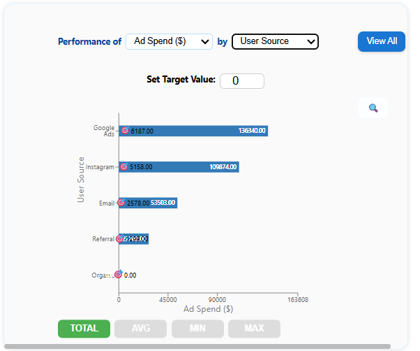
This view was generated automatically in AutoGen Reports after uploading a standard Excel export from Shopify and Meta Ads.
Tips from Analysts
-
Look beyond CTR — focus on Cost per Revenue Generated (CPRG) to judge performance.
-
Separate brand vs conversion campaigns — both have value, but different ROI profiles.
Common Mistake Over-investing in top-of-funnel platforms (like Instagram) without seeing if traffic converts downstream.
5 How to automate inventory and fulfillment tracking in Excel
It’s easy to miss operational red flags like low stock or late shipments — until they hit customer satisfaction or delivery time.
These KPIs summarize your inventory status, late shipments, and product return rates — without needing Excel formulas or filters.
Whether you're building a weekly fulfillment report in Excel or reviewing warehouse trends, this view gives your operations team a real-time pulse on issues that need attention.
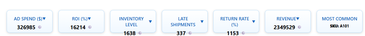
This inventory dashboard was generated in AutoGen Reports by uploading order and return data — no template setup required.
Tips from Analysts
-
Set thresholds for stock alerts based on velocity (not just count).
-
Use return rates to audit product quality or fulfillment issues.
Common Mistake Monitoring only order volume — while ignoring rising late shipment or return rate trends that erode customer experience.
Why This Matters
With the right visuals, you stop reacting and start planning. Trends become visible before they escalate. Anomalies are flagged without digging. And every team — sales, marketing, ops — stays aligned with real-time insights.
Ready to Skip the Manual Work?
You don’t need to write macros or learn BI tools.
Upload your Excel sheet— whether it's a weekly, monthly, or quarterly sales report — and AutoGen Reports will automatically extract KPIs, trends, and insights.
It’s built for users who want Excel automation for sales reports without writing formulas or building pivot charts.
In just 2 minutes, you’ll see:
-
KPIs tailored to your e-commerce business
-
Interactive dashboards with real-time filtering and category breakdowns
-
Summary insights ready to export or share with your team