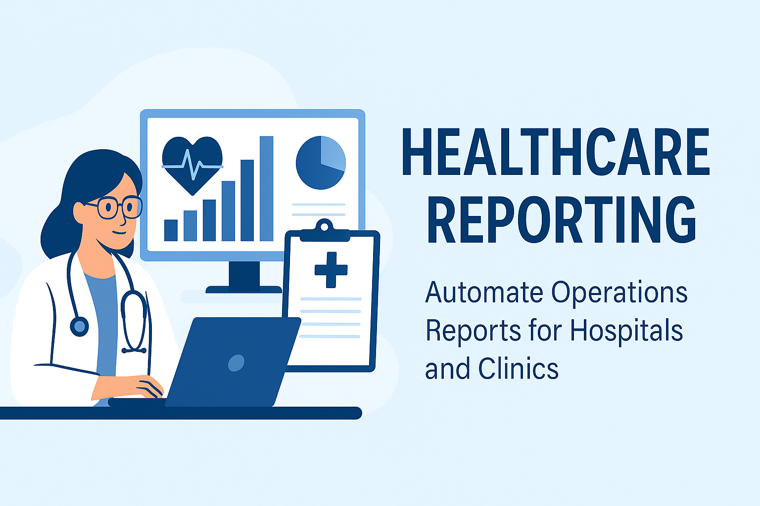
How to Generate Instant Operations Reports for Hospitals and Clinics
Hospitals and clinics deal with more than just patients — they deal with complexity.
From overworked staff to unpredictable patient inflow, healthcare teams often rely on Excel to track operations — but these spreadsheets are hard to analyze, update, and explain to others.
This guide shows how to automate healthcare operational reporting using real data and visual dashboards.
Common Operational Challenges in Healthcare
Whether you're running a multi-specialty hospital or a small clinic, these problems sound familiar:
- Patient wait times are unpredictable, and tracking them manually wastes staff time.
- Doctor or nurse workload is unevenly distributed — some are overbooked, others idle.
- Bed occupancy data is stuck in Excel, with no visual forecast for ICU availability.
- Appointment schedules are updated across files, causing mismatches and delays.
- Department efficiency is unclear — high-performing units get lumped with the rest.
What Instant Operations Reports Can Do
AutoGen Reports takes raw appointment, staffing, and capacity data and turns them into meaningful insights. Here’s how it helps.
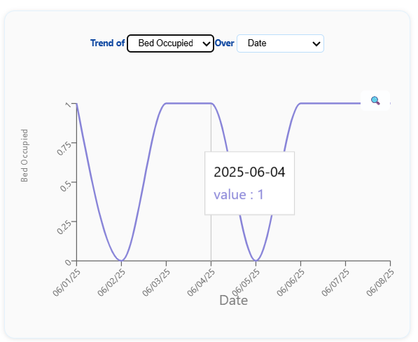
1 How to track patient wait times using appointment data
Manual tracking via Excel makes it hard to monitor delays between check-in and consultation.
This timeline chart highlight number of bed occupied over a specific date range.
Tips from Analysts
- Track time between appointment slot and actual consultation start.
- Identify departments with recurring delays — flag for capacity review.
Common Mistake Assuming that all delays are due to staff — when patient no-shows or overbookings may be the root cause.
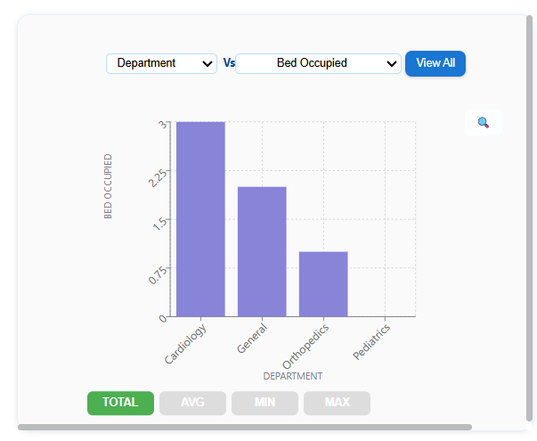
2 How to visualize hospital bed occupancy trends
Bed capacity issues often go unnoticed until it’s too late. AutoGen Reports gives a bar chart of occupancy % by ward or ICU.
This helps hospital admins forecast surges and plan transfers or discharges more proactively.
Tips from Analysts
- Track weekly trends and overlay seasonal flu/COVID cycles.
- Use department-wise splits to reassign beds dynamically.
Common Mistake Monitoring occupancy as a daily snapshot — trends matter more than single-day spikes.
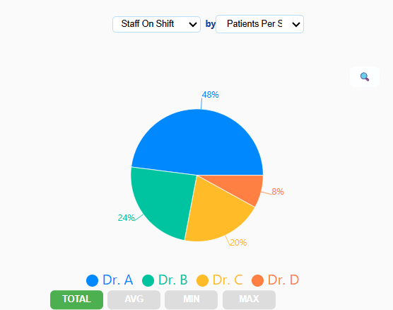
3 How to monitor doctor and nurse shift utilization
Using just Excel, it’s hard to see how overworked or underused your staff is. AutoGen’s workload chart shows patients handled per shift and time spent per patient.
Tips from Analysts
- Combine appointment and consultation logs for accurate shift insights.
- Highlight underused hours to improve appointment slotting.
Common Mistake Equating shift duration with workload — it's patient count and consultation duration that matter.
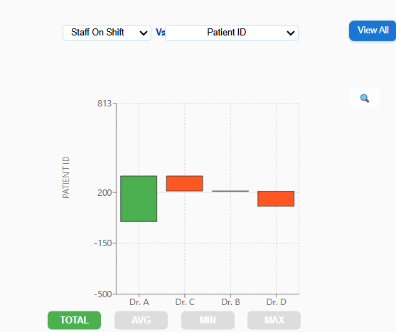
4 How to detect department-level efficiency issues
Some departments operate with lean staffing, others get overloaded. This waterfall chart compares average patient handling time and satisfaction rating across units.
Tips from Analysts
- Add patient feedback rating for a balanced performance view.
- Identify departments with both long wait times and low satisfaction.
Common Mistake Relying only on satisfaction scores — operational metrics give needed context.
5 How to automate weekly hospital performance reporting
Every week, teams scramble to gather data from scattered Excel files. AutoGen Reports turns all of it into one clear dashboard.
- KPIs for appointment volume
- Bed utilization
- Staff efficiency
- Department trends
Tips from Analysts
- Set thresholds to flag alerts (e.g., >85% occupancy for 3 days).
- Use past 30-day trends for forecasting, not just reporting.
Common Mistake Reporting lagging indicators (like discharge count) without forecasting what’s next.
Why This Matters
Visual reports allow healthcare teams to go beyond reactive fixes — they enable proactive planning. Instead of crunching numbers every week, teams see patterns early, allocate resources smarter, and improve both outcomes and morale.
Ready to Make Reporting the Easiest Part of Healthcare?
You don’t need Excel formulas, macros, or BI tools.
Just upload your hospital or clinic spreadsheet — and AutoGen Reports handles the rest.
You’ll see:
- Wait time charts, bed trends, and staff KPIs
- All generated automatically — no setup, no coding
Try AutoGen Reports — No Signup Needed